

The signal and the noise in meta-analysis
The signal and the noise in meta-analysis
What does r/r² mean in a meta-analysis scatterplot? Not much

OK, it has been written about already by some others, but I also want to talk about this John Protzko pile-on:


Here's the original plot in case the tweet goes down:
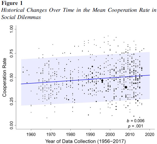
First we might notice that the error bands are unusually large. Protzko didn't actually make the plot, as some critics imply. Yuan et al did it themselves in their study:
Yuan, M., Spadaro, G., Jin, S., Wu, J., Kou, Y., Van Lange, P. A., & Balliet, D. (2022). Did cooperation among strangers decline in the United States? A cross-temporal meta-analysis of social dilemmas (1956–2017). Psychological Bulletin, 148(3-4), 129.
The error bars are larger than expected because Yuan et al plotted the prediction confidence intervals, not the parameter confidence intervals. I don't know why they did that, but whatever. There's a few replies that make fun of him, and social science in general, like this one:
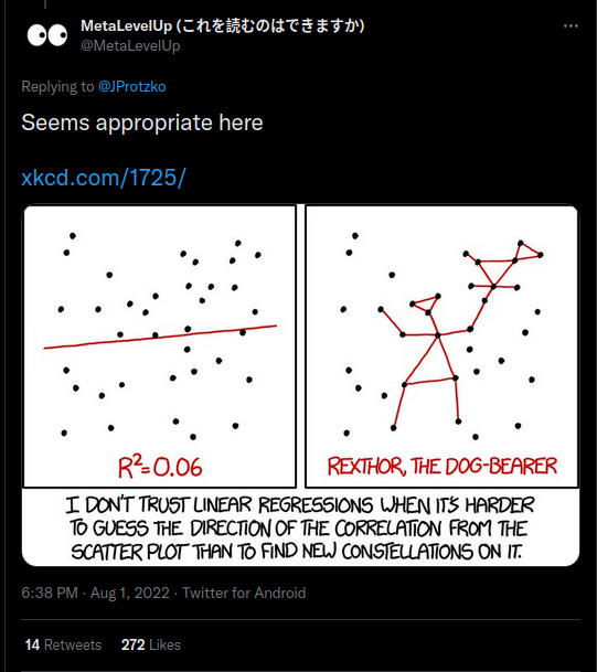
This is basically a complaint that the r/r² value is too small. One can indeed make such a complaint sometimes, but with this kind of meta-analysis with a temporal moderator, the error is on the critics' side. The reason is that the r and r² values are entirely arbitrary when plotting results from a meta-analysis, and that's because they are a function of the statistical precision of studies, not the trend itself.
Let me give you an example. Across centuries, human height has starkly increased. A nice meta-analysis study is: A century of trends in adult human height (2016):

So it used to be that tall male populations were about 170 cm and now they are more like 180. A gain of 10 cm or so. A standard deviation for male height is about 7 cm, so this is a gain of about 1.4 d. A huge effect size, that can easily be noticed when you walk into old buildings. You often hit the head on the door frames. The studies we have of height are based on large, representative samples. This is totally unlike in most social science, where samples are generally small, thus yielding low precision. Maybe you see where I am going with this. Suppose we imagine two meta-analyses of human height over time. One based on based on small studies and one on large studies. They could look like this:

We see that the left plot has a lot more noise, though the correlation is still decent at .68. On the right side, the plot is near perfect. What are the effect sizes? Simply go back to 7th grade math. Look at the line of fit. Where does it intersect the y axis at year 1900, and where does it end at year 2000. That's right, both plots show that the historical trend is exactly the same, 1 cm/10 years. The only difference is that the studies in the left meta-analysis are a lot less precise. In fact, each study is a mere n=5, and on the right side, n=1000. The r/r² does not tell you what you want to know here. It is not an estimate of the effect size over time.
In this case, we are measuring only means, and it turns out that even with n=5 per study, the left plot has a high level of signal in the scatterplot sense (r = .68). But that doesn't have to be the case. If we had instead studied something that can only be less precisely estimated, such as cooperation, then the dots on the left side would be a lot more noisy. So let's repeat this exercise, but study something harder to precisely quantify, a correlation between height and income. Let's pretend that this correlation has been increasing over the years. We might get something like this:
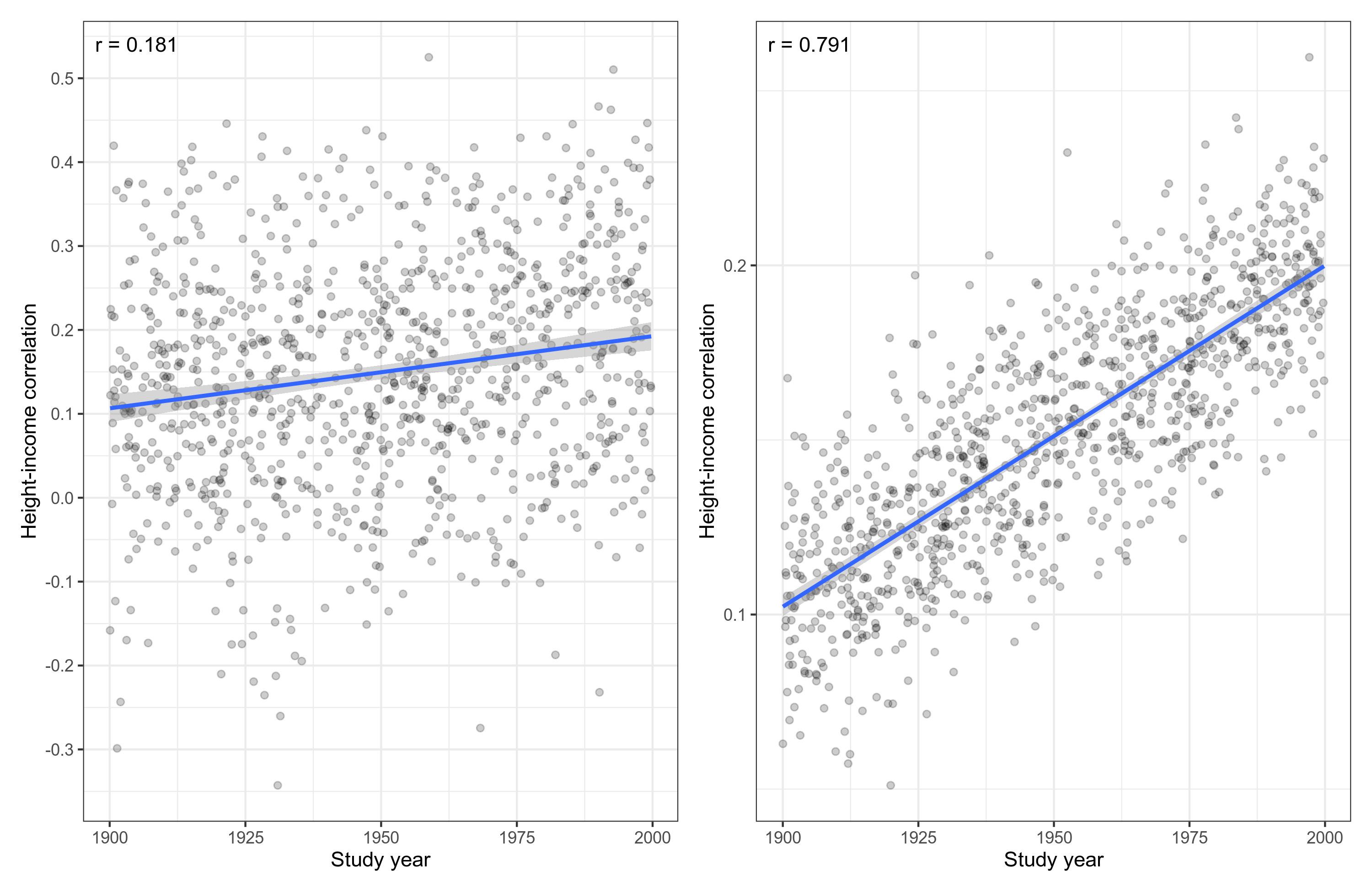
There sure is a lot of noise in these meta-analyses. In fact, the sample size for studies on the left side is n=50 and they are n=2000 on the right side. Correlations are just that much harder to estimate where even n=2000 studies will not give you a perfect line of fit in a meta-analysis. Looking more closely as we did before, though, we see that the slopes are the same. What these two meta-analyses are telling us about the historical change is exactly the same: the correlation goes up by about 0.01/10 years, changing from about 0.1 to about 0.2.
TL;DR John Protzko did nothing wrong.
Since the usual claim is that cooperation has decreased drastically, showing any scatterplot with cooperation rates flat/increasing (and definitely not decreasing drastically) is food for thought. That the temporal trend is small in whatever unit is to miss the point there: it shouldn't be small! At the least, it should make you think about how it can be possible to have both drastically decreasing cooperation as measured by things like going to your local Kiwanis and also have people being just as nice as ever to each other in artificial lab experiments.
They don't specify why the predictive interval, but that should be obvious given that it's a random-effects meta-analysis: it's the interval of interest for the parameter relevant to individual studies, the within-study cooperation rate. There is substantial heterogeneity between each lab experiment (lab, experimenter, experiment/test, local population, recruitment...), so in planning a well-powered experiment, the global mean is unhelpful - oh, there's a global mean cooperation rate across all possible combinations of variables of 50% but also basically zero probability the exact cooperation rate will be 50% when you go to run it in your own particular lab? That's, uh, good to know...? But if you do your power analysis based on that, you will be over-optimistic because you are ignoring that uncertainty due to heterogeneity. Much better to know how wide the spread on your actual cooperation rate will be: plotting the *predictive* interval tells you your realized cooperation rate could be anywhere from 25% to 75%, and you will base your power analysis on that. (So you wouldn't assume optimistically that you'll get the nice 50%, which maximizes information from binary comparisons/outcomes, you'd assume your rate would be high/low by 25%, which usually means you'll need substantially more _n_.)
I bet my bottom dollar that if the authors presented the yearly weighted averages, these people would be soyfacing over their results. The rank-order correlation between year and weighted cooperation rate would be yuuuge. The increase from 1971 to 2002 is roughly 6 times as large as the standard error. For a given 15 year interval, there should be a 95% chance that the studies at the last end of the interval are higher in cooperation than the studies at the first end of the interval.